The posters for Varsity Blues, the Super Mario movie and so many others really fell short of expectations.
A few years back I did a list of the 11 Worst Movie Posters of the ’80s. When I was recently researching my list about Ice Ice Baby I saw the poster for Vanilla Ice’s 1991 movie Cool as Ice — and I knew it was finally time for a follow-up.
So these are my picks for 11 of the worst movie posters of the 1990s. Let the catty nostalgia commence!
1 | Cool as Ice (1991)
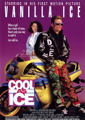
The design here is actually kind of cool-cheesy — so many colors! — but it’s everything surrounding the design that lands the poster on this list. (1) Vanilla Ice trying so hard to look cool while a “proper”-looking girl observes. (That haircut plus a periwinkle cardigan is the universal sign of a proper girl.) (2) The special mention that this is Vanilla’s “first motion picture.” (Ha.)
And finally, (3) the wildly convoluted tagline: “When a girl has a heart of stone, there’s only one way to melt it. Just add Ice.” Ice melts stone now? This is like the whole South Park debate melting someone’s icy heart with a hot/cool island song all over again.
2 | Necessary Roughness (1991)
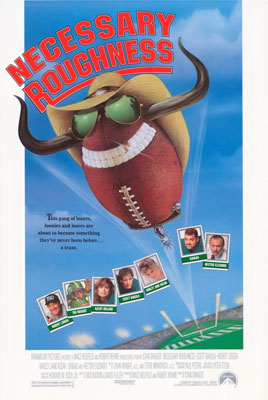
Takes a pretty cool football movie and makes it look like a total joke. How did they see this film and decide their best marketing angle would be a janky cartoon football with horns and sunglasses? If you didn’t think Scott Bakula was marketable — even though this movie came out right when Quantum Leap was in the middle of its run — at LEAST put Kathy Ireland in her uniform on there.
3 | Exit to Eden (1994)
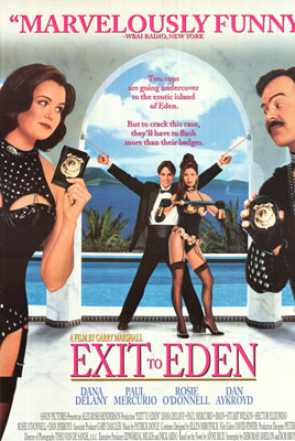
I bet there were at least 100 executives who took pixel-by-pixel looks at this poster to try to answer the burning question: “How much Dominatrix Rosie O’Donnell is too much?”
Little did they know the answer is “Any amount.”
4 | The Program (1993)
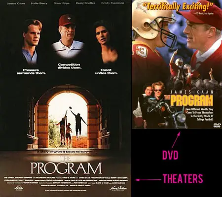
I put the DVD cover side-by-side with the theatrical poster to show how they eventually figured it out. The movie poster makes it look like this is Rudy-meets-
School Ties-meets-the Saved by the Bell freeze-frame high five. The DVD cover lets you know you’re dealing with a gritty football movie that features badass rebels on motorcycles and a dirty football team that’s not-so-subtly based on Florida State. And that’s what we wanted to see.5 | Side Out (1990)
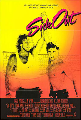
Yeah, it’s from 1990 so it’s almost an ’80s movie… but come on. This poster is at least six or seven years out of date. By the ’90s we weren’t burning people’s retinas with ungodly color schemes of hot pink, yellow and orange anymore. We wanted teal everything. (Beyond the colors and the “Side Out” font, C. Thomas Howell’s face also really helped get this onto the list. Who performs a fingers-interlocking high-five without even looking at the other person?)
6 | Super Mario Bros. (1993)
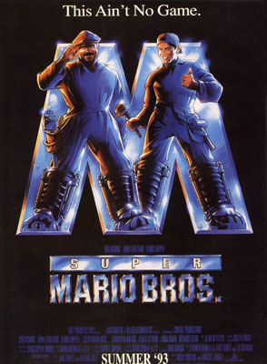
So you’re turning the most popular video game of all time into a movie. Why NOT go with the tagline “This ain’t no game”?
7 | Top Dog (1995)
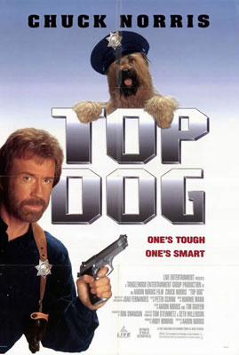
Laughably bad Photoshop work on the disembodied dog here — by 1995, anyone could do better than this in Photoshop. Also, it’s really not clear to me between Chuck Norris and the dog wearing the police hat which one’s tough and which one’s smart. I mean… if Chuck Norris is the tough one making the dog the smart one, why does the dog look so goofy and have the hat on crooked?
8 | Cop-and-a-Half (1993)
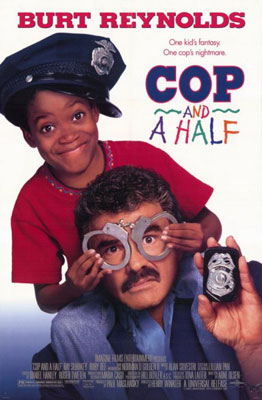
Once upon a time, Burt Reynolds was a symbol of manliness and coolness. I think this poster would make him want to punch himself in the face.
9 | Varsity Blues (1999)
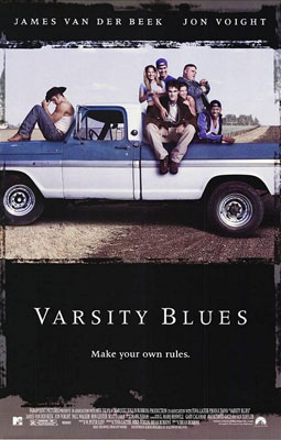
I’m a big Varsity Blues guy. I make little subtle references to it constantly on this website. There’s a lot I like about this movie. A plot-irrelevant, pre-Instagram Instagram photo of the cast sitting on a pickup truck in a random dirt road? How could that possibly make me care about this movie?
(Also, why did they take this photo when Amy Smart had just dyed her hair black? Why does it make Tweeder look like the main character? Why isn’t anyone at least holding a football?)
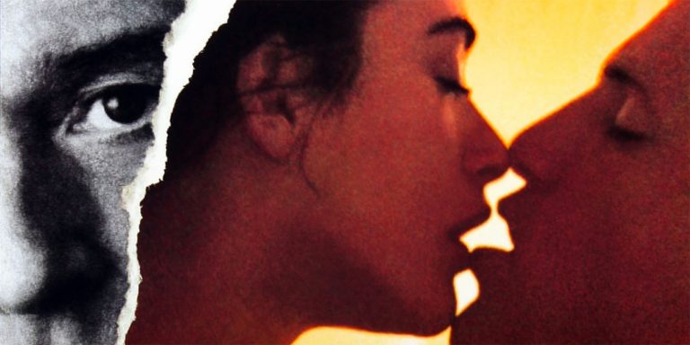
10 | Indecent Proposal (1993)
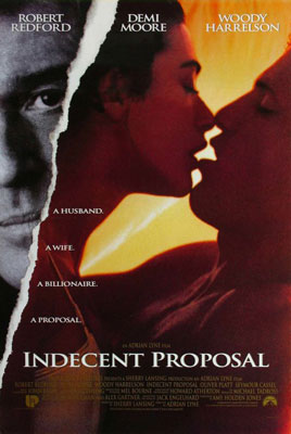
I’m pretty sure whomever made this poster didn’t actually see the movie. It’s really, really NOT actually about the steamy romance between Demi Moore and Woody Harrelson. And also, that “torn paper” graphic should go between Demi and Woody, not between the couple and Robert Redford. He tears THEM apart. He’s not torn apart from them.
11 | Thelma & Louise (1991)
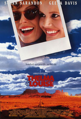
Why look at those two gals smiling! There certainly won’t be anything dark in this movie!