Posters used to be so amazingly cheesy in the late ’80s and early ’90s. Here are some of the finest baseball ones.
Sports posters, along with white rap and Michael Keaton, peaked as the 1980s ended and the 1990s began. It was before athletes got too cool to pose for absurd posters, but after the popular style transitioned to garish and corny. Fortunately for me, I was at the perfect age to hang sports posters. Unfortunately for me, there was no Internet or eBay, so my poster selection was basically limited to what was available at the three or four sporting goods stores in my area.
On the recent suggestion of my friend Troy, I went looking at posters from that era, almost all of which were made by a company called the Costacos Brothers. They’re like the Zubaz of the posters world. I collected enough fantastic posters to make lists for MLB, the NFL and the NBA. Since baseball is wrapping up right now, I figured it was time to roll out the MLB list.
Here are 11 surreal, comical, and so-ugly-they’re-beautiful Major League Baseball posters from the late ’80s and early ’90s.
1 | Will “The Thrill” Clark: Willpower
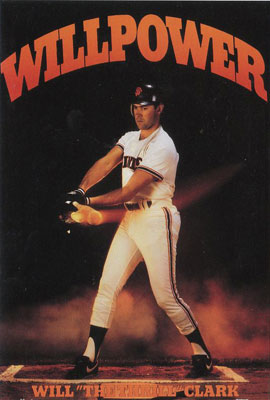
This might be the most perfect one of all. They make a special point to emphasize that it’s not just Will Clark but Will “The Thrill” Clark… and he has a completely wooden, expressionless look on his face as he makes solid contact for what appears to be a sharp single up the middle. Does this guy know how to party or what?!
2 | Cory Snyder: Gunsmoke
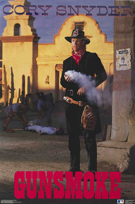
Since Cory Snyder was born in southern California, went to college at BYU, and played for Cleveland — and nothing about his name lends itself to a wild west pun — so you have to infer they picked this poster theme based on the “Indians.” Although the execution is puzzling…
– Cory Snyder, who’s an Indian, is in a cowboy hat
– He just used a gun (which traditionally a cowboy’s weapon, not an Indian’s)
– He apparently shot a Yankee (which was more of a Civil War reference than a cowboys-versus-Indians reference)
– And it happened in front of the Alamo (where Texas battled Mexico).
Their historical references are splatter-painted all over the place, yet somehow the whole thing is overcast with offensiveness.
3 | Wade Boggs: Out of This World
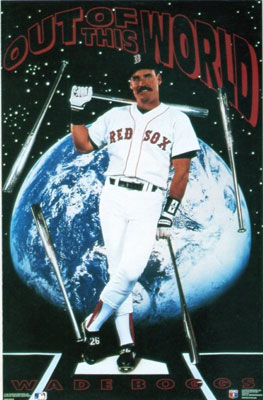
Remember in the early days of web design when everyone went for the “stars in the sky” website background — then quickly moved off it because it looked so cheap? The stars of Geocities and Angelfire looked *better* than the clip art stars they used here.
4 | Dave Winfield: Class
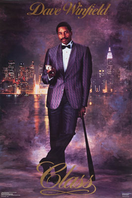
As they once said on The League: “Nine times out of ten, when a sportscaster is referring to someone as a ‘class act’, they’re talking about [someone] who’s black.” But vague racial overtones aside, Winfield is killing that amazing purple tux.
5 | Mike Greenwell: Gator Tough
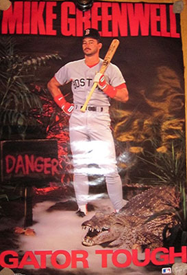
Mike Greenwell’s nickname was the Gator (I assume because he grew up in Florida, or killed it in a bit part in his middle school’s performance of Peter Pan). Actually I just read it’s because one year during spring training he captured a small gator, taped its mouth shut, and put it in a teammate’s locker. But I like my Peter Pan line so I’m just going to leave this entire sloppy paragraph as is.
6 | Kevin Mitchell: Bat Man
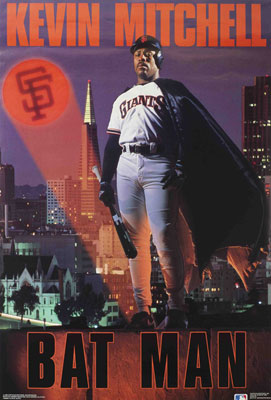
By putting the space in Bat Man, I guess they avoid trademark infringement. Although I’m confused, since Kevin Mitchell is wearing he cape, but also seems to be lighting the SF Bat signal rather than responding to it. Although I’m thinking some parts of this poster might be suffering from proportion and perspective issues.
7 | Eric Davis: 44 Magnum
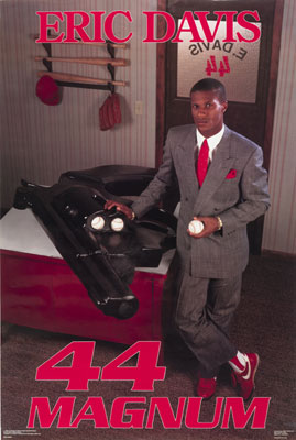
Just a guess, but if they make a poster today, they’re not putting a giant gun on it. (Or a journeyman outfielder.)
8 | Canseco and McGwire: The Bash Brothers
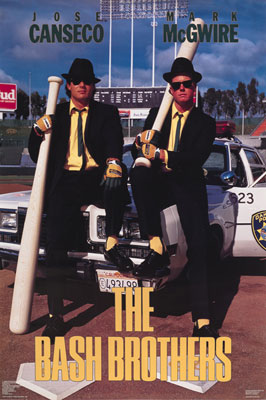
Had these two not done everything in their power (and artificially-enhanced power) to destroy their reputations over the past decade, this would be one of the better posters Costacos ever produced. But like everything else Canseco/McGwire-related, it’s tarnished. Also, on closer inspection, I’m wondering why there are two home plates. That’s very Tatooine.
9 | Greg Swindell, Pete Harnisch, Doug Drabek: Shooting Stars
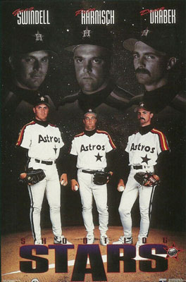
Can three past-their-prime pitchers really be considered shooting stars? You can tell from their Mufasa faces in the sky even they’re not sure why they got picked for a poster.
10 | Andre Dawson: The Hawk
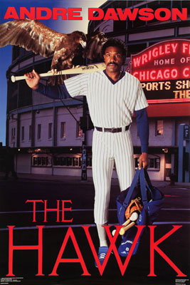
This poster was made before Costacos had the MLB license. There’s no Cubs logo, the Wrigley Field sign is strategically cut off, and I can’t guarantee it but I think that hawk was Photoshopped in *without* expressed written consent.
11 | Rickey Henderson: Man of Steal
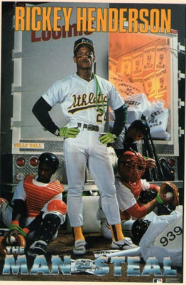
The players who posed for these posters almost all have facial expressions that fall in a spectrum from “being a good sport about everything” to “oh my God this is awkward.” Rickey, naturally, is the only one who looks outright pissed off to be involved.