Anyone else miss the dancing Spot, dancing baby, dancing MC Hammer… really, anything dancing?
There was something very comforting about the Internet in 1998. There wasn’t all this pressure for websites to be functional and interactive and informative. There wasn’t even any pressure to update them. People just made a homepage and left it up there.
If it was 10 years ago, I would’ve thought of the 11 points idea, written two or three lists, slapped up a message saying “More lists coming soon!!!” and then never touched the page again.
I think my favorite antiquated element of ’90s web design was the animated GIF. So pointless. So gaudy. So wonderful.
So today, we’re going to take a stroll down the nostalgia superhighway and reminisce about the best old school animated GIFs. Geocities, ho!
1 | The Dancing 7up Spot
![]()
To me, there’s no animated GIF that’s more iconic than the Dancing Spot. I don’t remember how 7up launched this guy as their mascot, and I certainly don’t know how it ended up becoming an animated GIF that everyone in the world wanted to include on their homepage… but it happened.
On the continuum of dancing GIFs, the Spot isn’t even particularly good… he’s just kicking back and forth in different directions while he pumps his arms up and down. But dammit, I’m STILL just fascinated watching him go.
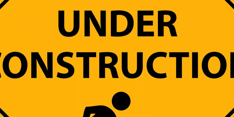
2 | Under Construction
![]()
I’ve always loved the use of “Under Construction” as a lazy man’s web design tool. As a medium, any website is eternally under construction. It’s not a magazine that has to go to the printer. It’s not a sculpture. It’s a website.
But slapping up an animated GIF that declared your website was “under construction” wasn’t a sign of redundancy, it was a sign of sloth. In 1998, when you said your homepage was under construction, you were basically saying you didn’t want to take the time to scan in your photos from the Better Than Ezra concert or convert your resume from WordPerfect into HTML.
And the odds were something like 8:7 that you’d never, ever, ever go back into Microsoft Frontpage and do any more construction.
3 | The Grabby Mailbox

Under construction GIFs always made heavy use of construction work imagery, which was funny to me… since construction on a website is pretty much the opposite degree of labor as construction on, say, a house.
Along that same line, for some reason, e-mail animated GIFs always made heavy use of regular mail imagery, like envelopes, stamps and mailboxes. My favorite of these… and, in my memory, the most popular… was the old mailbox with a hand coming out to “grab” e-mails.
Sure made ME want to e-mail the person, I’ll tell you that.
4 | The Spinning Earth
![]()
Ten years ago, many a person took a class where one of the big assignments was to make their own homepage. In college, I ended up in three different classes all of which had that project.
And, for some reason, people always gravitated toward using animated GIFs of the Earth spinning. I guess that since, back then, we all still used the figure of speech “world wide web,” the logical thought process steered people toward including “world” iconography.
Not that anyone from anywhere in the world would really ever stumble onto “Jeff’s Homepage For Comm Studies 201: Communication and the Internet” where the first line read, “What’s up, world? I’m Jeff. This is my homepage.”
5 | The Dancing Baby
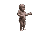
This was really one of the first Internet phenomena. And I was swept up in it. How could you NOT fall in love with a super-creepy baby doing hypnotic, undulating dance moves?
Especially when the person also included the “ooga chaka” song on their homepage to serve as the perfect soundtrack to the baby.
6 | The Eternally Spinning Counter
![]()
In the ’90s, everyone loved putting counters on their page. What a cool way to show how popular your page is: A counter that looks like an odometer, tallying up each time a person checks your site out!
The counter begat the eternally spinning counter… a GIF that made it look like your page was so popular that your counter just couldn’t stop spinning up.
Naturally, this was nothing more than a thinly veiled slice of overcompensation; you put up a real counter, realized you’d only gotten 32 hits in a month, and then decided to replace the real counter with a fake animated one. That way, you still have your requisite counter… but without the humiliation and stigma of said counter being a billboard of your unpopularity.
7 | The Netscape Dragon

When designing a website in the late ’90s, it was crucial to remind your visitors that it would look best in Netscape. Netscape was so cool. Sure, today, it’s just sitting bitterly in an Internet retirement home next to Friendster, Prodigy and Altavista, but ten years ago, it was the king.
Anyway, when you wanted to promote your site’s Netscape friendliness, a good way was with an animated version of the Netscape logo. And the best of these was a graphic that showed the Netscape logo getting surprise attacked by a fire-breathing dragon.
(Actually, it had to do with Netscape being originally codenamed “mozilla”, a term that’s still used today as it became the template for Firefox’s coding, but talking about that is SO infinitely far away from what this list is supposed to be about, I’m going to stop immediately. Back to making fun of the ’90s we go…)
8 | The Waving American Flag
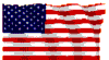
As you know, the Internet belongs to America. That’s why domain names have to be in English. We founded it, we regulate it and we produce more than half the porn on it.
Back in the ’90s, it was important for Americans to represent for America on the Internet. (Don’t forget, that was before this eight-year period of our elected leaders date raping our happiness away.)
And there was no better way to represent than an animated, waving American flag. It was as if a cool summer’s breeze was blowing through the Internet, wafting the smell of barbecue, fresh lawn trimmings and baseball into your family room, making that flag wave just for you.
9 | The Dancing MC Hammer

Dancing animated GIFs almost never fail, from the two I’ve mentioned earlier (the 7up Spot and the Dancing Baby) thru ones that I had to leave off this list, like Peanut Butter Jelly Time or the Dancing Hamster.
But one that I simply cannot leave off is the Dancing MC Hammer. Because this graphic is really pretty cool. The dance moves are impressive… especially for the low quality of animated GIFS… not to mention COMPLETELY mesmerizing. Just try not to watch this one over and over and over.
10 | The Flaming Line

THE choice of all “bad” Internet sites. Goth kids’ homepages… sites that were tributes to things like gas masks or Satan… GWAR fan sites… they all used the flaming line.
It only worked against a black background. It let visitors know that some dangerous information would be presented ahead. And it let you know that, yes, we have a yellow under construction animation too… but we’re still hardcore.
That’s why we went with Angelfire instead of Geocities.
11 | The Spinning Police Siren

Oh wait… Matt Drudge still uses this today. Never mind.