
When letters don’t have the proper amount of space between them, sometimes it really changes their meaning.
There are certain words and phrases that make the eyes of the web nerd light up with schadenfreudian glee behind his or her smudged, dark-rimmed glasses. BLINK. Times New Roman. FrontPage. Emboss. Optimized for Internet Explorer. Frameset. Papyrus.
Today, we’re focusing on one of the most beloved: Kerning.
No, not one of the bullies from The Simpsons. [Chuckles to self.] Kerning is the process of adjusting space between letters to make them more visually appealing. Or, on the flip side, letters spaced so disastrously that they are an insurmountable sandbag.
I trolled around the Internet to find examples of kerning disasters; looking, in every case, for a situation where poorly kerned type created unintentionally dirty results. Here are my 11 favorites.
1 | Walmart.com: Just a click away
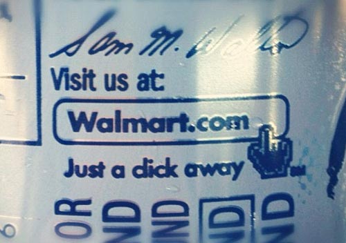
I haven’t gone to a Walmart in many, many years primarily because of all the dicks there. It’s amazing how the opportunity to save eight cents on a box of Raisin Bran can bring out the worst in people.
2 | Pem’s (?) Barber Shop
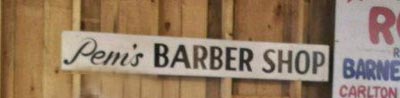
It certainly looks like Penis Barber Shop. But unlike all of the other examples on this list, I’m not entirely sure what it’s supposed to say. Pem’s Barber Shop? Perm’s Barber Shop? Perri’s Barber Shop? How come Penis Barber Shop is the most clear-cut option?
3 | Shower drape
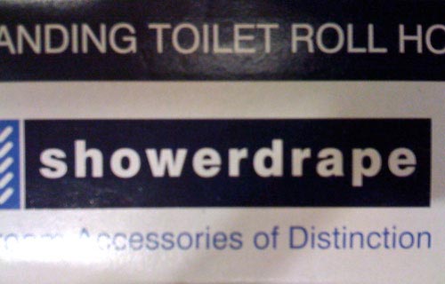
I mean really. This didn’t catch *anyone’s* eye in the production process? Just add a tiny bit of extra space between the first “r” and the “d” and you take out all of the really unpleasant ambiguity.
4 | Featured Flicks
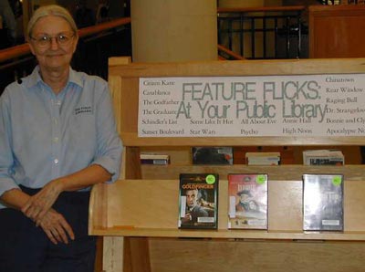
There are a bunch of photos online where “Flicks” gets poorly kerned into “Fucks” — but this is the only one that also kerns “public” into “pubic” AND has an inadvertantly naughty librarian overseeing the entire thing.
5 | CLINT!
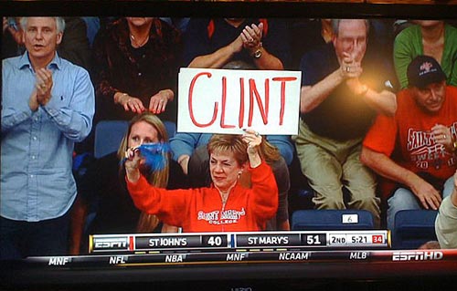
This sign was for Clint Steindl from St. Mary’s… who would go on to be the goat when he blew his team’s chance for a 15-seed upset in March Madness. I still say his mom’s sign is a bigger embarrassment — and will probably be a more lasting legacy.
6 | Arthur’s Pom Plus
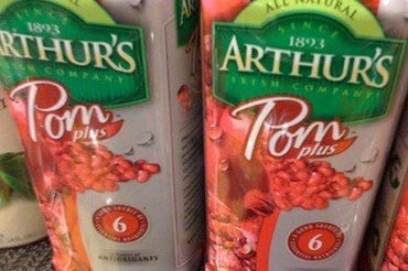
This is more of a reverse-kerning trick — our eyes take “Pom” and turn it into “Porn.” Possibly because there’s no such word as “Pom.”
7 | Arts Exchange
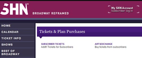
I picked this one over a much more popular kerning photo of Kidsexchange because I used that on a list (11 Funniest Real Business Names, Dirty Edition) in 2009. And I’d like to believe being repetitive is not my job. My job. My job. Being repetitive is not my job. So I didn’t do it.
8 | Pen is broken
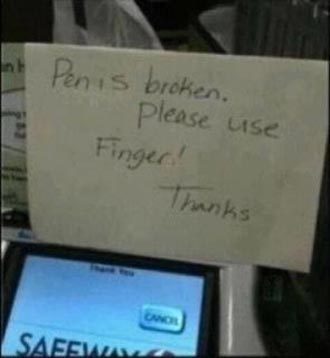
This one might be intentional. This sign was two centimeters away from not being dirty at all; instead, it’s the most sexual one on the list.
9 | Clowns freak me out
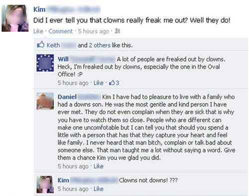
My favorite part? The first person who commented on this (Will) tried to follow the modern trend of tying every post online, regardless of content, to plastic cup political rhetoric. The second person (Daniel) completely blew that generic approach out of the water by getting kerned into thinking ol’ Kim has beef with the mentally challenged. In two posts, this completely sums up Facebook discourse.
10 | Final registration
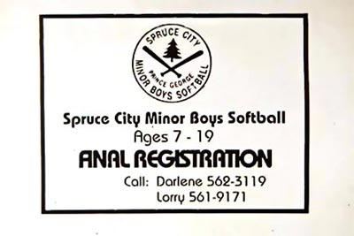
Just to be sure, I’d recommend setting things up with Darlene, not Larry.
11 | Shitake mushrooms
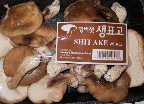
There are a few words that sound dirty but aren’t. Shitake is one of them. Shih-Tzu, angina, Phuket, Volvo, coccyx, pianist, Uranus, seaman, masticate, Google yourself, titmouse, and so on. We don’t need bad kerning to explain the joke so blatantly.